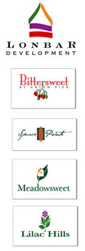

LONBAR DEVELOPMENT
This developer of fine Michigan vacation homes first came to Hermelink
Design for a logo and a brand image. What may appear at the outset to
symbolize a sailboat on the lake is in actuality an adaptation of the
hobo sign for "good house." The logos and brochures
designed for Lonbar's developments reflect the natural beauty of their surroundings to entice high-end
buyers. Visit lonbardevelopment.com for more.
Sub-logos for Lonbar properties start with Bittersweet, named for a wild indigenous bush. The saturated color and elegance of the Spruce Pointe logo suggests artistic design for the discriminating buyer; its web site, sprucepointe.com was also created by Hermelink Advertising Design, in sync with the matching brochure. The light-hearted Meadowsweet and Lilac Hills logos suggest a more casual property (look closely at the Lilac logo). This family of logotypes was created to be at once coordinated in its look while remaining individually distinctive.
click on any logo to enlarge all